Goya and Value Studies
Francisco de Goya y Lucientes (Spanish, 1746–1828) is regarded as one of the greatest painters and printmakers of the late 18th and early 19th centuries. The Norton Simon has an exceptional collection of Goya’s work, with nearly 1,400 prints, three paintings and one double-sided drawing. Goya is a master of the effective use of value—that is, the relative darkness or lightness of a color. His etchings are an ideal medium for exploring how he exploits value for powerful graphic and emotional effects. In this activity sheet, we will analyze the artist’s use of value in the etching Here Comes the Bogey-Man (Que viene el Coco), from his series Los Caprichos (The Caprices).
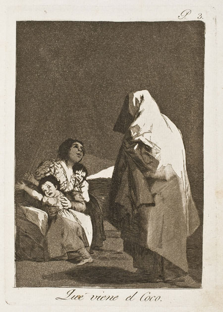
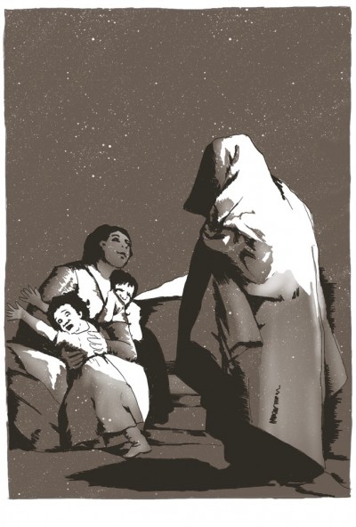
Francisco de Goya y Lucientes (Spanish, 1746–1828), Caprichos: Here Comes the Bogey-Man (Que viene el Coco), 1799, The Norton Simon Foundation
Value
Any color may be analyzed through a combination of three components: value, hue and saturation. Of these three components, value plays the largest role in the understanding of volume and space, in addition to contributing to mood and atmosphere.
Goya generally began his etchings as linear designs and then finished them with aquatint. Aquatint (described below) is a means of quickly creating an even value over an area of the image, just as when an artist applies a wash of ink over paper.
Francisco de Goya y Lucientes (Spanish, 1746–1828), Detail of Holy Week in the year [illeg.] (Mascaras de semana santa del año [illeg.]) (verso), 1796–97, brushed India ink on paper, Norton Simon Art Foundation
Here Comes the Bogey-Man (Que viene el Coco)
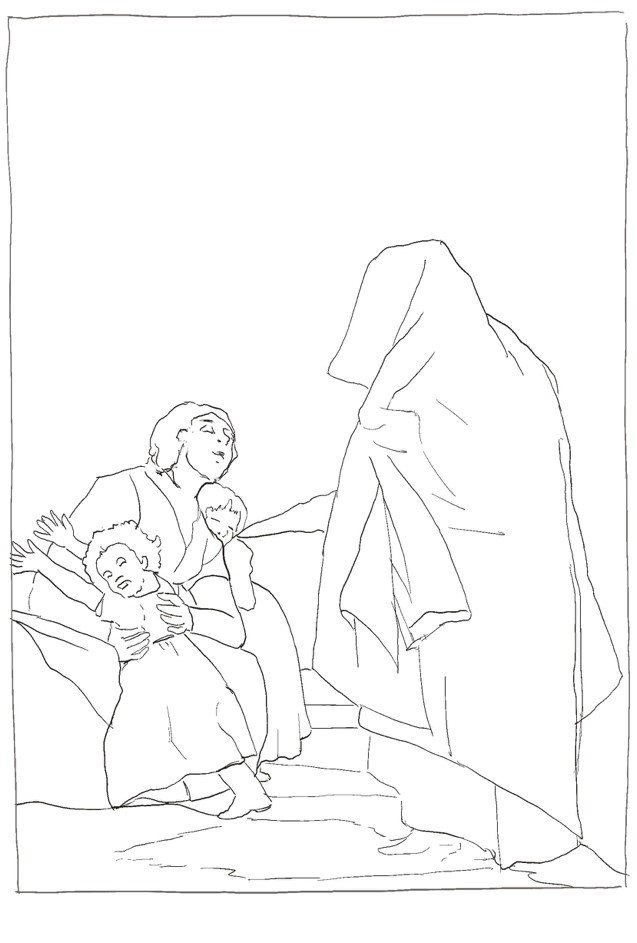
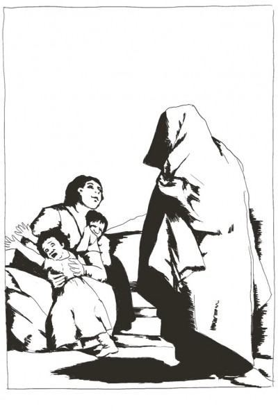
To study Goya’s use of light and dark in this work, we will organize the etching into a three-value scheme: first, a general dark (almost black); second, a middle gray; and, third, the very light value of the unprinted paper. As we work, we will maintain the shapes of these values, seen in the original design with an initial linear sketch.
The Darkest Value
Goya has used line and hatching (closely spaced parallel lines) for the darkest values. By varying the width and thickness of these hatched lines, he easily controls subtle variations in the dark values. He uses hatching to create the darkest values in the hair of the woman and children, the darkness of the child’s skirt on the right and the cross-hatched lines (hatched lines that intersect each other) on the left border of the Bogey-Man’s cloak. For our purposes, we will simplify all of this linework into one dark value. This dark value will establish our overall design in much the same way that Goya would do with a pen in an ink drawing.
The Middle Value
The middle gray is created by laying an aquatint over the entire plate. An aquatint is produced through a dusting of ground rosin that has been adhered onto the plate through heat. The plate is then placed in an acid bath, where the acid bites around the small particles of rosin. This produces a rough surface on the plate, so that it will hold thin layers of printing ink. The longer the plate is left in the acid, the deeper the acid “bites” into the plate, creating a rougher texture and hence, darker values. The grainy texture seen in the print is the result of the acid biting the plate around the larger grains of rosin.
The Lightest Value
For areas where the artist would like to preserve the light value of the paper (such as the upper right-hand portion of the Bogey-Man) an acid resistant solution, or “stop-out,” is painted over the aquatint (the rosin adhered to the plate) prior to the acid bath. The stop-out preserves the original polished surface of the plate so that these areas do not hold ink when printed. With the addition of the middle gray value, our analysis is beginning to resemble the print.

Burnishing
Note that there are areas of the middle gray where Goya has slightly lightened the value with burnishing. We see this in the forehead and left arm of the woman, the skirt and arms of the child on the left and the lower portion of the Bogey-Man’s cloak. Burnishing the rough aquatint smooths the texture on the plate so that these areas hold less ink and print slightly lighter. I have lightened these areas in our analysis to simulate the look of the original print.

Drawing Exercise
One of the most useful exercises for studying value and composition is to analyze a picture by reproducing it with only three values. In this way, one is compelled to simplify the broader relationship between the value shapes and understand how the artist has arranged his or her values for graphic impact. The limitation of only three values is important because it compels us to make choices and/or compromises in order to have our analysis read well. This will help us not only to understand the choices the artist has made but also to arrange values effectively in our own work.
The choice of which three values to use depends on the image being analyzed. In Here Comes the Bogey-Man, we have chosen a dark (almost black), a middle gray (darker in value than a 50% gray) and the white of the paper. In another image, such as Goya’s Saint Jerome in Penitence in the Norton Simon’s collection, we might choose a dark (one step away from black), a middle gray (the value of St. Jerome’s red wrap around his waist) and a light gray (approximately the lightest value of the large rock holding his books).

Francisco de Goya y Lucientes (Spanish, 1746–1828), Saint Jerome in Penitence, 1798, The Norton Simon Foundation
It is not important to include as much detail as in the demonstration above. These studies may be a mere 4 x 6 inches (or smaller), and they are successful as long as they are reasonably accurate with regard to the shapes and the value choices. The finished work should capture the overall appearance of the reference. It might look very much like the demonstration above (prior to lightening the middle gray to illustrate the burnished aquatint).
You may find it most useful to start with a simple sketch to identify the general shapes within the frame. Once you are satisfied with the accuracy of the sketch, the darkest or middle value may be applied (or blocked in). The choice of which of these two values to begin with will depend on the image you are studying. A rule of thumb might be to start with the value that will establish the overall image most quickly and clearly. In the example, I began with the darkest value, as this established the shapes quickly, and it was an extension of my initial sketch. I could, however, have started with the middle value once I had completed my initial sketch. After the first value is established, add the second value, paying careful attention to the shapes and edges. If the final value is the white of the paper, there is no need to add a third value.
Suggested Materials
Any materials may be used for these studies, as long as a solid wash of value or tone can be applied without modulation or blotchiness. Avoid very linear media, such as pens, as these are difficult for building up solid shapes of value. Most dry media will work effectively (graphite, charcoal, colored pencil) as well as painting media (gouache, watercolor, acrylic, oils).
Lesson by teacher and artist Richard Houston